City & Guilds Photography

Thursday 26 May 2011

Unit 211 - Ways of Presenting Images - Photoshop

The previous post about different ways of presenting photographs was mainly about the different paper finishes and traditional methods. Photoshop can also play a very key part when presenting photographs. This is because there are many alterations and different things you can do to your photograph before actually presenting the image. In this post I will be showing some of my photographs and how I have edited them in photoshop to make them look how they are. I will be taking screen grabs of what I did on photoshop to achieve my final photographs.


This is my first photograph I will be editing. Now when I took this I had no idea that it would turn out like this. As you can see it is very dull and there are features in the photograph that are distracting to the viewers eye so really this photograph needs a lot of work to bring it back to life.


The first objective is to crop the image down to a reasonable size. Using this tool crops the image down to a certain size chosen by myself. This potentially gets rid of anything in the corners or side that aren't meant to be there and can completely transform your photograph. To achieve this I chose the size of the height, length and DPI (dots per inch) as shown in the top screen grab. When I have made my decision the photograph will be that size when it is cropped no matter what. As you can see after this has been done the image has been cropped down and looks a lot more even without any distractions.


Moving a little away from the main editing side of things on photoshop. Layers are very important when editing a photograph in photoshop. They provide a quick link back to what the original photograph was before the edit was put in place. This is great for when an edit doesn't go to plan or doesn't look right. I chose to duplicate the layer when cropping the photograph. This creates a layer which is exactly the same as the highlighted layer. After naming the layer appropriately you can apply the edit which you can then switch between quickly if you do not like it.


At the moment I feel that the photograph is very dull. This gives a very negative feel when looking at the photograph because the photograph is supposed to display a bright vibrant spring feel and this doesn't really show that. To do this I created a new adjustment layer (displayed in the first screen grab) and then chose "levels". Levels are used when you want to change the leveling of blacks, greys and whites in a photograph. This then brightens the photograph up quite a lot and can have quite a dramatic effect on the photograph. As you can see from the second screen grab I have increased the amount of white to brighten up the photograph and slightly increased the greys to equal this out.


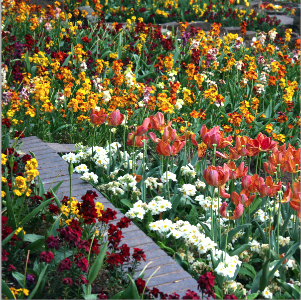
As you can see after I have applyed the leveling edit it has completely transformed the photograph making it look bright, vibrant and full of colour.


This is my second photograph that I have chosen to edit for a number of reasons. When I look at this photograph I am distracted by the other objects creeping into the photograph. The main distraction is the other part of the tree on the right side of the photograph which is invading the photograph. I also think that the colour isn't great in the photograph. I think that the colour could be a lot more stronger making the photograph look a lot more colourful.


Again, I selected layers and then duplicate layer like I did on the first photograph to duplicate the highlighted layer. I then chose my settings for the crop which were 20 inches in width and 15 inches in height alongside 300 dots per inch. As you can see from after the crop has been applied the tree looks a lot more centered and not as much invading it.


Next is to sort out the colour. I might be being picky here but I feel that the colour on this photograph could be stronger and perhaps more bolder. There are many different methods for changing the colour on a photograph and all work in different ways. I personally like using the curves method which is displayed in the screen grab above. This method displays a diagonal showing colour strengths. From here you can adjust the line of colour balance to how you see fit for the photograph.


As you can see from the first of the two screen grabs not a lot of adjusting was needed but just that little bit of curve movement can have a dramatic effect on the colour and boldness of the photograph. As you can see there is a massive difference in how the photograph looks now compared to earlier.

Thursday 19 May 2011

Research - Theme One - John Shaw

John Shaw will be the next photographer who I am going to be researching. After this piece of research I will also be going out on a photoshoot to attempt his style of photography. This will also be great practice for me to attempt this style of photography which I feel is very important when taking nature photographs. His style is similar to Ansel Adams. The only real difference between the two is that John Shaws work is mainly in colour and Ansel Adams work is mainly in black and white. Below are ten of my favourite photographs from John Shaws collection which convey a strong colourful visual message in which I will be attempting myself.


This first photograph displays exactly what I mean. As you can see his style is similar to Ansel Adams photography. The main focal point is centred in the photograph showing it’s dominance. This means that the viewer will know what this photograph is displaying. Like normal colour is also concentrated in this photograph with two very different colours split in the photograph from the greens i the tree to purple field leading into the background.


The second photograph I have chosen is a little different to the first but uses the same style. Again the main focal point is developed due to the tree placed in the centre of the photograph but what makes this photograph different from Johns other work is that it is taken at dusk. This creates a silhouette of the main focal point making it stand out even more thus creating a completely different feel to the photograph to if it was taken during the day.


These two photographs both have a pattern feel to them but both use the pattern style in different ways. The top photograph has one tree bark centred in the photograph and then starts to span out wider with the other tree barks. This is great as this is what the viewer will notice when looking at the photograph. I would also say that lines to guide the eye were used here with the trees leading out further into the background of the photograph. The second photograph also uses patterns but they don’t span out into the background, instead they almost slope of diagonally from right to left. This effect appears with the tops of the trees being yellow and how the photograph was taken. It was taken at a certain level to get the trees at a correct height starting with the small trees on the right to them growing to the left and then to the right again. The top photograph is also very similar to the work of Ansel Adams. This photograph is very similar due to the patterns evolving from the trees where they expand out deeper into the photograph.


The next photograph I have chosen is a close up style photograph but again he manages to make the main focal point stand out by placing it right in the middle of the photograph. Again this is great as it shows the viewer what the photographs visual message is displaying without the viewer having to look around the photograph for it. Again like normal colour was also concentrated here with the yellow from the petals on the flower. A low F-stop would have been used here as nothing in the background is in focus making the close up of the flower stand out a lot more. This also helps convey a stronger visual message showing the dominance of the main focal point.


These two photographs have both been taken by myself. I have taken these to copy the style of some of John's work. As you can see both are close ups and both main focal points are centered in the photograph just the same as John Shaw. Both include a high concentration of colour (top photograph more darker natural colours, second photograph using more natural light alongside brighter colours) the colour from both flowers brighten up the photographs which is needed especially in the top photograph where natural light is quite low. I had to watch what I was doing here in terms of health and safety because I had to lean over other objects to get quite close to the flower. This was taken into consideration as I could have easily fallen over and not only done damage to myself but done damage to the environment.


This photograph highly concentrates on lines mixed with colour. He has stood square on to the subject which is involved in the whole of the photograph creating a lines effect from the different colours of the flowers in the field. Colour with natural light is mixed together here to create a warm colourful photograph.


This was my attempt at the photograph above. As you can see it wasn't taken in a field but I have tried to re create the same concept with the different colours mixed with lines. A medium amount of natural light was used here so the amount of colour involved boosted the photographs brightness.


This photograph is the style of photograph that I am going to be aiming to achieve on my next photoshoot. As you can see he uses the same style as Ansel Adams. The main focal point is the tree in the distance of the shot without any distractions or interruptions in the photograph. This makes the main focal point stand out alot more than if there were other trees in the shot. This immediately draws the viewers attention to what the photographer intended the viewer to look at. This shot would've been completely different if there were no tree involved. Again as normal colour is also concentrated here with many different bright colours mixing with the bright natural sunlight creating a bright and colourful photograph.


Patterns mixed with colour is concentrated in this photograph with the different Autumn colours blending in with the position and structure of the trees. Nothing else is included in this photograph so this suggests he may have zoomed a little to only include this in the photograph. He would've been postioned square on to the trees to also create this effect.


These two photographs both include more than one object that create a main focal point. Again this is all down to where they are positioned and how little interruptions there are in the photographs. As you can see in the bottom photograph the three palms are placed directly in the middle of the photograph with nothing but the background supporting there postion. This is great as it directly places the viewers eye to these three palms first and nothing else will be distracting them. It is the same situation for the top photograph, the two trees are placed in the photograph one to the left and one to the right. The one of the left would probably be more of the main focal point due to its size and dominance. As you can see from the position this photograph was taken from the trees almost look like they are touching each other creating a small frame within frames effect. Both photographs highly concentrate on colour. The top photograph having a darker sky making the main focal point look alot more bolder and the sky in the second photograph being a pinkish/blue colour creating a warm photograph.


Above is a video I have found on youtube about John Shaw where he talks about his natural history of photography and what has kept him shooting for so long.


All John Shaw's photograph were found from this website http://www.nikonusa.com/Learn-And-Explore/Photography-Tips/g1attuky/1/The-Essential-John-Shaw.html


Unit 211 - Ways of presenting images

There are numerous ways of displaying and presenting photographs. These can either be digital or practical. Below I have described many different ways in which you can present photographs and the benefits from them.


Traditional


Prints


Prints are the most popular way of presenting images. This is mainly due to the fact that there are that many different ways of presenting the image not only when printing the photograph but also when displaying the photograph to others after the print has surpassed. There are many different websites and places to order prints off which have a wide range of extras like framing and mounting etc to offer as well as prints. Popular websites include www.printspace.co.uk and www.photobox.co.uk These businesses don't just offer the standard print on paper. There are many different paper finishes that you can choose to which suits your photograph best. Below are a few popular finishes that can be used to print a photograph onto.


Gloss Finish


The gloss finish is a very popular type of paper finish that is chosen for many different types of photography. Gloss gives a shiny look onto the photograph which produces making the photograph look more vibrant and giving the traditional look that the photograph might need.


Satin Finish


The satin finish is used on photograph to create a highly rich look combining a semi gloss finish with it. They produce vibrant high quality images with low glare. Again, a very popular type of paper surface which is used for many different types of photography.


Matte Finish


The matte finish is also a very popular finish that many photographers use. It comes into rival with the gloss finish because they are completely different from each other but both create a professional print. The matte finish creates a low glare vibrant coloured photograph that really does show, especially when printing black and white photographs.


These are just a few different types of paper finish that can be used for photographs. It really depends on what feeling you trying to express in your photograph to what paper finish to use.

Displaying


Printing photographs isn't just the main area that needs to be concentrated on when presenting photographs. How you are going to display your photograph is also a very important aspect which needs to be highly considered when presenting your photographs. Again, there are many different ways of displaying your photographs. Below are few different ways of displaying them.

Frames


Frames are probably the most popular piece of finishing equipment that people use to display there photograph. This is mainly because there are many different types of frames that you can use which combine different shapes, sizes and colour which is best suited for the photograph you have taken. For example you can have a full frame where the photograph is placed directly in the centre of the frame and not filling it. You can also go for the style of having landscape or portrait frames it really depends on style of photograph you have taken and how you want to present it.


Photobooks


Another popular choice of presenting photographs. This is a great choice if you want to show a collection of photographs as apposed to just one or two. This can also be customized to great lengths from the style of the photobook to how the photographs are positioned and displayed inside the photobook.


Digital


Displaying


Digital ways of presenting images is a newer way of showing you photography. It is an ever growing ay of presenting photography and will eventually be the dominant way. Although this method is fairly new there are many different ways of presenting your photographs digitally. Below are a few different ways of doing this.

Blogs, Slideshows and Presentations (Computerised)


This is the main method that people use to digitally present there photographs. Again like a traditional method there are many different useful tools that can be used when presenting the photograph on either of these. This method is mainly used when showing a group of photographs either on a blog or presentation. This is also a great method of showing the world your work. For example using a blog brings in the benefit that anyone can view your profile with your photographs displayed on it.


Digital Portfolio (iPad)


The digital portfolio has to be one of my favourite methods of presenting photo images. This is mainly because of the huge amount of customisation you can add to it to give it that origanality which edges over everything else. One of the main ways of creating a digital portfolio is by iPad or iPhone. Now obviously this is going to look a lot better on an iPad due to it's screen size, but there are certain applications that you can download from the Internet to the iPad/iPhone which are specifically designed for displaying photo images. Not only do these applications show off your photographs in a stunning way you can also edit the way you want to display them. Like I said earlier on in this paragraph the amount of customisation really is a huge amount. For this reason this will be the method that I will be using to display my images. I want to present my images in an original way rather than just print them out and frame them and I can accomplish this by presenting them this way. This will also be good practice for me for when I display my photographs to real clients as I will be using the same application to do this.

Portfolio Applications

There are many different applications to use on an iPad and they can all be used for many different things when presenting photographic images. Below are a few main applications that can be used and what they do.


FlexiFolio


Flexifolio is a portofio application that can be downloaded straight from the apple app store. It is a basic portfolio application that can also be used to transfer photographs, music and videos from iPad to computer. This application would probably be used by a first time user of this sort of application. It is quite basic but it can produce quite powerful portfolios.


Padfolios

Padfolios is a more in depth portfolio application that can offer quite stunning portfolios if used correctly. You can do all of the usual tasks on this application like you can on Flexifolios. You can also create beautiful titled portfolios which can be completely customized to how you see fit. You can then change the size of the font to how you like and even add a background photograph as a preview for the portfolio. With all of these combined together Padfolios is a great application for more advanced users in this area.


Xtrafolio 


Xtrafolio is another portfolio application which can also be downloaded straight from the apple app store. This is the application that I have used to present my work. This application can pretty much do everything when it comes to a portfolio application. From the start you can design the layout of you portfolios on how they are presented to the viewer. This is great as you can see a preview aswell as the title of the portfolio you wish to look at. There are also many different settings you change on your portfolio to how which order the photographs are presented all the way to creating a personal profile including what equipment you use. Once you have got used to the in's and out's of how the application works you can truly create your portfolio to how you want it.


Above is a short video clip on how the Xtrafolio application works. It quickly describes each area of the application and what you can do with it.